
AI, Web and Mobile App Development Company
Navarik Analytics System UX & UI Design
Navarik creates reports on oil products imported and exported to and from the USA based on data from their partners. The reports are not realtime but are delayed one week to one month. While not ideal, it is however, much better than the official reports which are delayed by 2–3 months. Providing this data in a timely manner is what gives Navarik an edge in the market.
The challenge Navarik faces is that they generate huge amounts of georeferenced data and they need to make it useful. Navarik approached us to show our vision of how this data could be visualized to provide business value.
We were challenged by the endless ways in which the data could be presented; lists, switches, charts and checkboxes swirled around in our heads as we brainstormed solutions. In the end we decided on natural language search along with rich infographics to provide the best interface. This design made it quick and easy for users to query system for the desired information and specify the type of chart. Smart autocompletion was added to further make the process faster and easier.
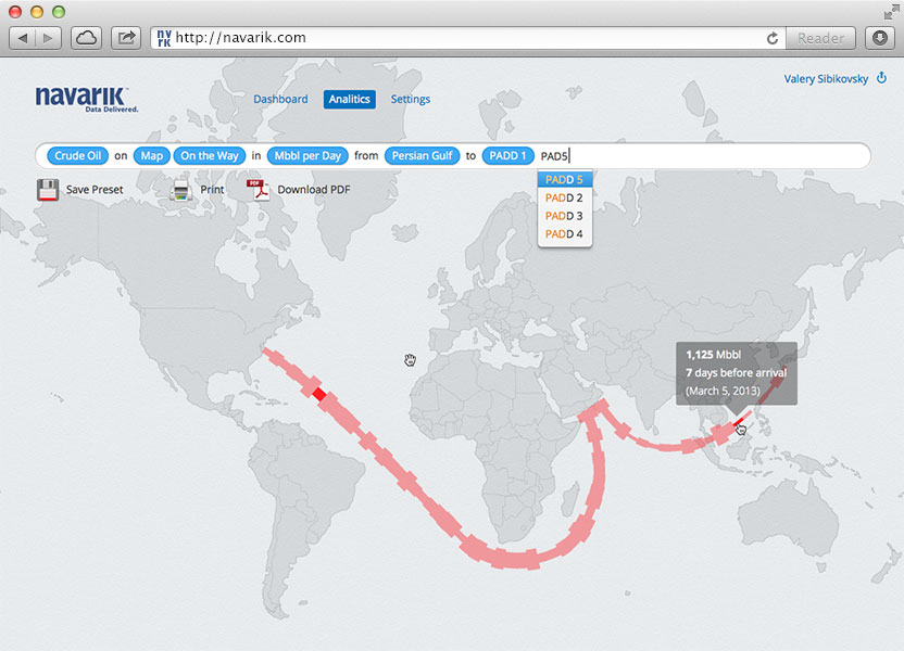
This map view shows how many barrels are enroute to their destination.
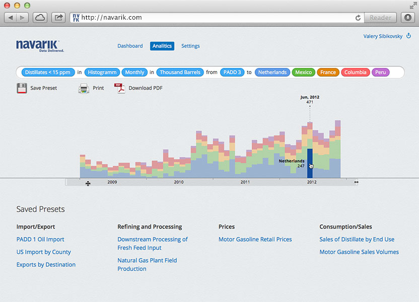
Colour coded histogram with flexible scope
Prior to drawing pixels, our task was to understand the data, big data. It's that kind of data that cannot be demonstrated or manipulated with standard tools. Luckily, Edward Tufte shared his ideas and experience and we were able to utilize a few of his clever methods to visualize the movement of oil around the globe. User interface design and prototyping were an exciting challenge to complete and the Navarik was thrilled with our work.
More Projects We Delivered
Innovative mobile application and web platform with integration to medical imaging and health data

Patient portal and web platform for Bodycomp Imaging–a leading provider of DEXA scans, utilizing superior Hologic scanners for high-resolution medical imaging
A web application for a technologically advanced, not-for-profit, sustainability project
A digital score keeping and record management web platform and iPad application for youth sports
A cutting-edge mobile app with bluetooth integration and intuitive UX or a leading precision measurement instrument manufacturer
The world’s first online encyclopedia of religious history. A comprehensive web platform for field experts, academics, and researchers