← Go back
The Designer Difference:
Why hiring a professional designer to create your brand matters
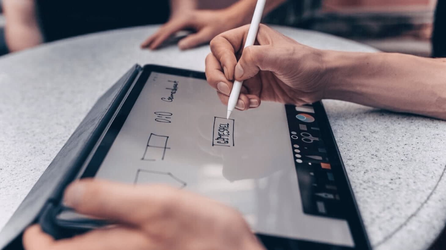
Packaging your high tech app requires a coordinated branding effort; with fonts, colours and a logo that all work together. The advantage of hiring a professional designer to develop your brand is that they are trained to see things you and I just won’t. They also have years of experience, which allows them to stay ten steps ahead and plan efficiently.
When it comes to digital design, your pro will create shapes and patterns that flow with the hierarchy of the information you are trying to get out. For example, have you ever noticed that you intuitively know which words and images on a webpage are clickable? Does that call to action pop, making it the first thing you see on a page? A designer can optimize your business information for every digital layout, making you brand clear, easy to recognize and efficient to navigate.
Planning
The choices you have nowadays for creating your brand are endless - 17 million web colours! Who can decide? A designer will help you see through the clutter, by asking the right questions to help you convey the mood and tone of voice of your brand. Who are your customers? Are you selling to other businesses or directly to consumers? Is your company vibe more conventional or cool? As a business owner, you need to feel comfortable in the skin you’re in; with a brand that conveys your company message and stays true to your unique values. A designer will give you a variety of options to choose from but in the end you always make the final decision.
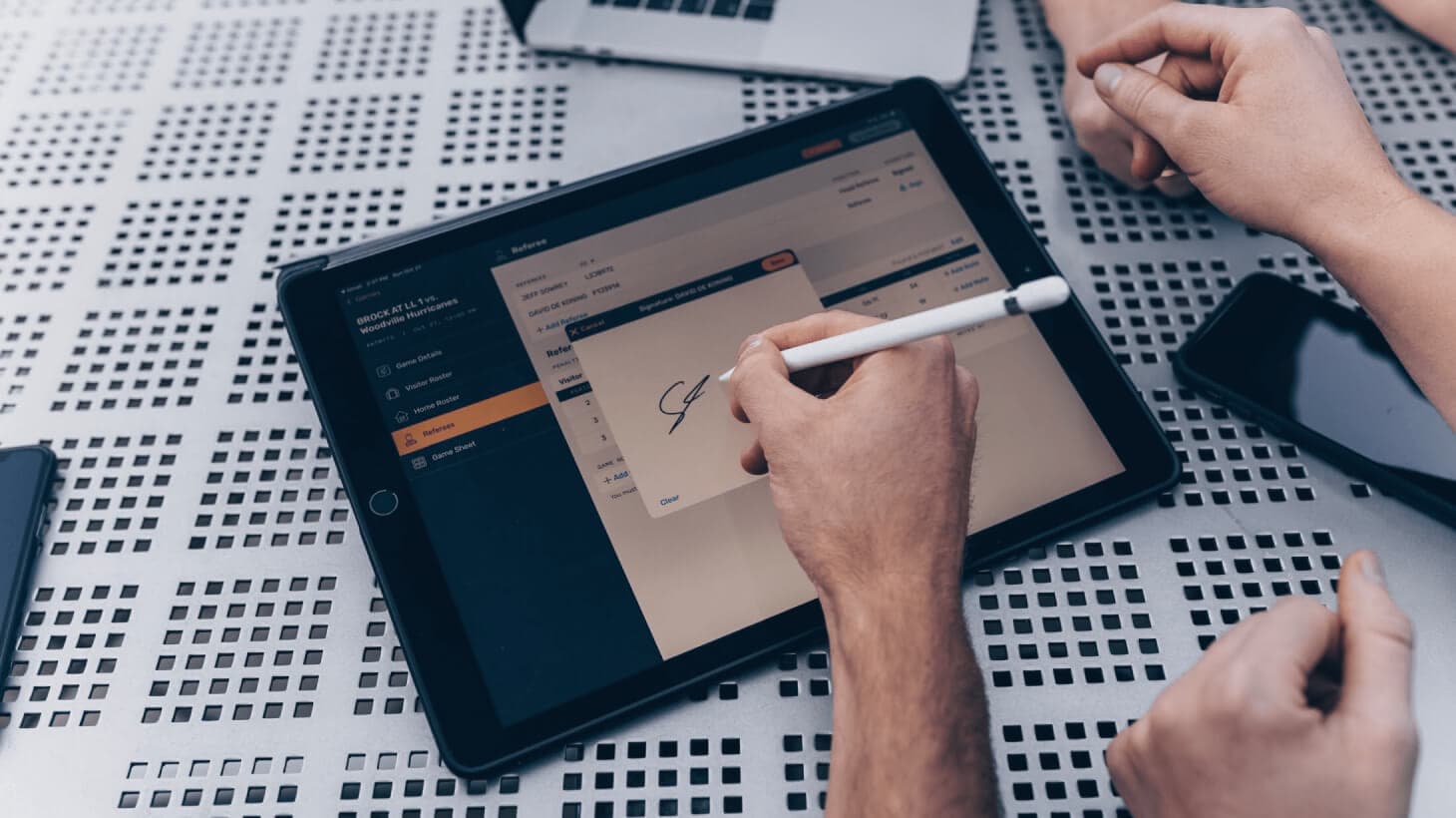
3 Elements of a Brand
The basics of any brand start with a logo, a colour scheme and a font choice. A slight variation can create a strong difference when it comes to how people subconsciously view your brand. For example, ever notice how a circular logo conveys a softer feeling, while a square logo seems like more of a strong statement? The usage of shape, colour and typography let your brand become original, recognizable and unmistakable in any context.
Logo
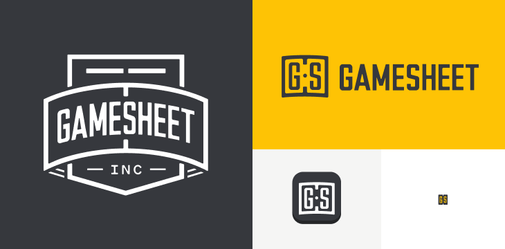
When thinking about branding, the first thing that comes to mind is usually the logo. A great logo becomes synonymous with your company name, so it is essential to create one that looks good in a variety of settings. For example, will the horizontal variation look good as a header on your website? Will it hold up as an app icon? Does it print well on your business card or coffee mug? Again it is important to keep these questions in mind and plan from the very beginning.
Colour
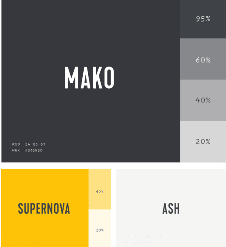
Colour is the most difficult branding decision you will make. Your colour scheme goes everywhere. From T-shirts to business cards to websites, your brand colours should look good on and off-line. Choosing three digital colours that also print well is a good start. You can think of them as your principle brand colour, your accent colour, and your background. With nearly 17 million RGB colours to choose from, a designer will help you determine which of those to eliminate right off the batt.
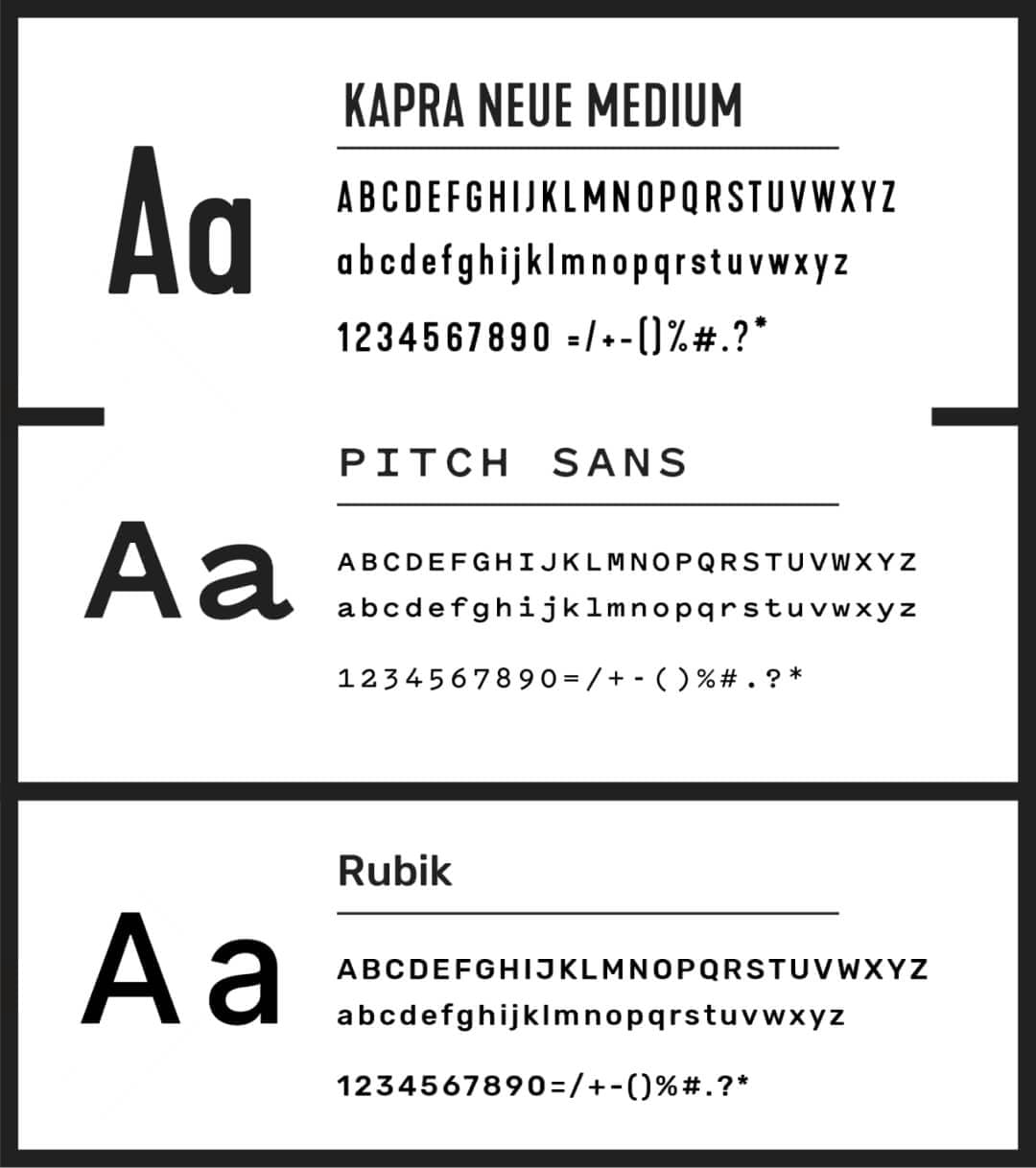
Font
Your font expresses your character. What’s the personality of your brand? What’s the goal? Try to stay objective. Is your typeface legible? Is it big enough to read on a smartphone? Does it make sense with your logo ? Colours? All the branding pieces should be cohesive on a subconscious level.
Digital Products are Different
Designing a digital product comes this its own set of challenges and opportunities. A good colour on the internet may not show up the same way when you print it - the last thing you want is your logo visible in two very different blues. For a digital product it’s also important to follow the web accessibility guidelines, these are designed to make the web more available to users with disabilities. Digital products need to be usable above all else, which means easy to navigate and easy to read on all screen sizes and devices. When designing for the web, the call to action should be clear, with button shapes, colour and type all indicating “click me.” All in all, hiring a professional designer will help you stay on top of your game with a great looking brand that stands the test of time.


Jane Friedmann
Marketing Strategist
